Color Accessibility
In Espressif’s documentation, color is frequently used in diagrams, tables, flowcharts, etc. When applied thoughtfully, color helps readers interpret complex information more quickly and accurately.
This chapter provides guidance on color accessibility in technical documentation. It covers general principles of color accessibility, recommended palettes, Espressif’s conventional palettes for specific uses, tools to custom and verify your own color palette, and a checklist. The goal is to ensure all sighted users can access visual information effectively, regardless of their color perception.
Note
This section applies when color is used to convey information. If colors are used for decorative purposes only, currently there are no special color requirements.
General Principles
Use Colors for Communicative Purposes
In technical documentation, color is a functional design element that should always serve a clear communicative purpose. Before choosing color palettes, you need to know what intentions will the colors convey. A clear purpose leads to good decision of how many colors to use, the appropriate color sets, and suitable brightness, saturation and hue, reaching the best communication effect.
For example:
Use bright colors to highlight key components or emphasize important elements.
Use easily distinguishable colors to differentiate functions or categories.
Apply color families (e.g., Closely related hues with tonal variations) to indicate relationships or group similar elements.
Use low-saturation colors for backgrounds to reduce visual clutter.
When applicable, follow established color associations (such as red for error and stop, green for success and confirm, gray for disable and inactive, etc.) to support consistency and intuitive recognition.
Do not Use Colors Alone
Do not use color as the sole means of conveying information, whenever possible.
Before using colors, look for other means to convey information, such as different shapes, written texts, signs, etc., to avoid potential color distinguishing troubles.
If colors are used, pair them with text labels, patterns, shapes, or iconography to ensure meaning is preserved for all users. Here is a recommended approach redundant coding from CUD (Color Universal Design):
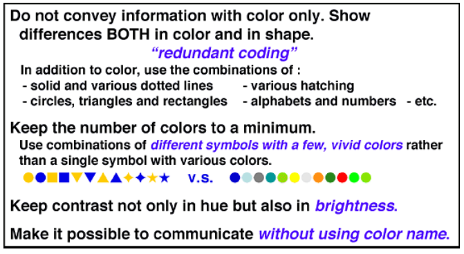
Redundant Coding Principle when Assigning Colors
This principle is especially important for key information conveyed by colors ingested by AI chatbot for Q&A. AI system dedicated for text analysis primarily processes text information, and ignores or misinterpret non-textual information conveyed by visual elements. When it comes to colors, such AI system can be seen as a “monochromacy” — unable to distinguish colors at all. Therefore, when using color to convey meaning in AI-ingested documents, it is essential to include explicit textual descriptions as valid redundant coding, without using the color name as a media. See Example 4: AI-friendly Approach for exemplification.
Avoid Confusing Color Pairs
Avoid confusing color pairs that are hard to distinguish for color blind people as primary contrasting elements.
Different types of color blindness affect how people perceive colors. The most common type is deuteranomaly (green-weak), followed by protanomaly (red-weak), while tritanomaly (blue-weak) is rare and other types are extremely rare. Based on the proportion of color blindness types, the following table lists color combinations that are most likely to be confused by people with these conditions and should be avoided in technical documentation, such as red–green, green–brown, blue–purple, etc.
Color Pair |
Commonly Affected Type |
Reason to Avoid |
|---|---|---|
Red & Green |
Deuteranopia, Protanopia |
Most common confusion; colors appear similar or indistinct |
Green & Brown |
Deuteranopia |
Similar lightness and hue; often indistinguishable |
Blue & Purple |
Tritanopia |
Purple may appear blue due to inability to perceive red |
Green & Grey |
Deuteranopia |
Low saturation green blends into grey tones |
Dark Red & Black |
Protanopia |
Red appears darker, may be mistaken as black |
Blue & Grey |
Tritanopia |
Low saturation causes difficulty distinguishing |
Light Green & Yellow |
Deuteranopia |
Can appear nearly identical in brightness and hue |
To make the table more vivid, the figure below shows the visual effect of colors in the eyes of a deuteranopia (Refer to Color Universal Design):
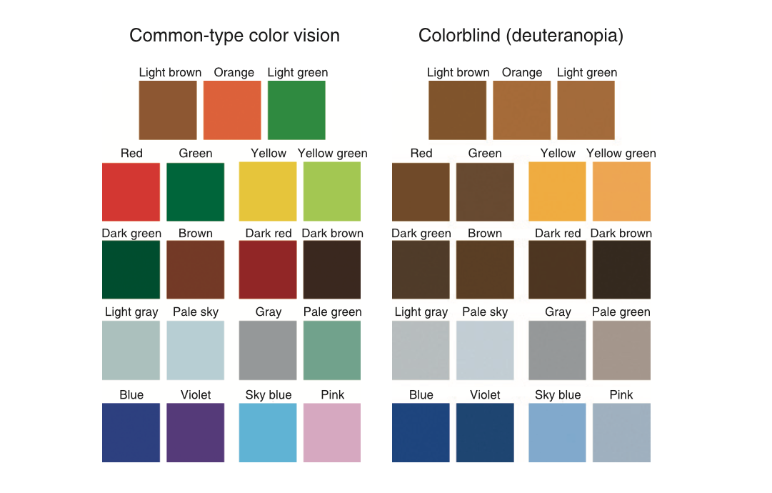
Comparison: Different Color Visions
Ensure Sufficient Contrast
Ensure sufficient contrast between colors in text, backgrounds, and image elements, so that all content remains clearly distinguishable and easy to read, even when they are printed out in grayscale. See Example 3: Insufficient Contrast for exemplification.
Recommended Color Palettes
Depending on the purposes of color usage, you can:
Refer to Espressif’s Conventional Color Palettes for common images/tables/documents, such as block diagrams.
Choose colors from Established Palettes for General Uses by color experts and research organizations.
Custom and Verify Your Own Palette for less common and specialized use cases with the suggested tools.
Conventional Color Palettes
For certain illustrations in Espressif documents, writers and editors have been following habitual color choices. For example, different shades of blue are used in functional block diagrams. These established practices prove to have acceptable color accessibility.
By convention, the following color palette is used when creating functional block diagrams in Espressif documentation. Please follow this convention when creating similar illustrations. Use exactly the same color code (RGB & HEX provided below) to ensure effective visual effect.

Current color palette for functional block diagrams
Tip
If you created a color palette for use cases commonly seen in Espressif documentation, we encourage you to share it with us. Your palette might be included in Espressif’s conventional palette sets for broader reference!
Established Palettes for General Uses
If you do not intend to create a palette, here are some well-recognized palettes for your reference.
Inclusive Color Palettes
Color palettes published by UX designer Allie Ofisher are distinguishable for all variants of color blindness.
Inclusive Color Palettes
Color Brewer
ColorBrewer is a classic tool offering palettes with filters for colorblind-safe, print-safe, and photocopy-safe choices.
Color Universal Design (CUD) Color Sets
CUD color sets are optimized for readability and print clarity across various types of color vision.
Custom and Verify Your Own Palette
If you want to select colors and create a palette for certain use cases, you need to verify the color accessibility first. Here are some tools for you to easily simulate the visual effect of your palette.
Coolors - Palette Generator
Go to Coolors, and select
Tools-> Palette Generator to create a palette. After selecting the colors or input the color code of your color model (RGB, HEX, CMYK, etc.), click the eyeglass icon in the top menu to simulate the visual effect of different kinds of color blindness.Tip
Coolors is suitable when you choose the colors for your palette before applying them.
Coolors also provides a Color Contrast Checker that helps you assess color contrast.
Coblis – Color Blindness Simulator
Coblis is a webpage tool that allows you to choose a local image and simulate the color vision of different types of color blindness.
Tip
Coblis is suitable when you validate the color accessibility of an existing image.
Sim Daltonism
Sim Daltonism creates a real-time overlay window that filters your screen based on various types of color vision deficiencies. You can freely move this overlay across any part of the display — including web pages, diagrams, or app interfaces — to visually assess color accessibility from a color-blind user’s perspective.
Tip
Sim Daltonism is convenient for evaluating UI elements, as it allows instant, on-screen validation without needing to export or process images separately.
Built-in Tools
Similar simulation capabilities are available in design applications such as Adobe Illustrator. The details are omitted from this document.
Examples
This section offers examples of both effective and ineffective color usages in technical documentation to help illustrate the principles above. Example 1- Example 3 focus on common pitfalls, while Example 5 and 6 demonstrate good practices.
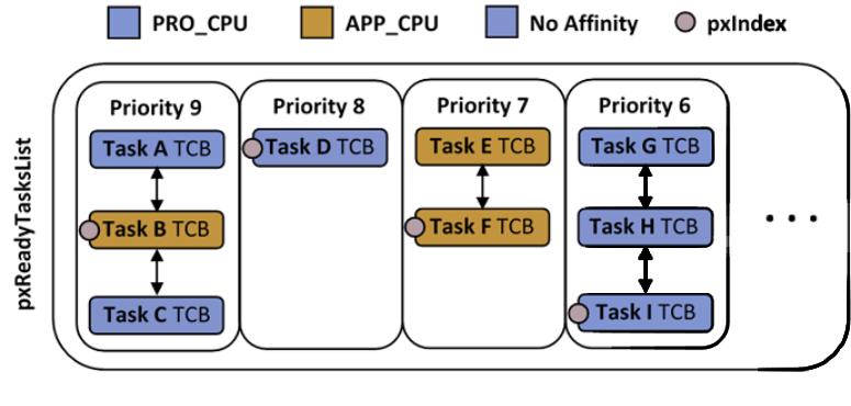
Example 1: A Confusing Color Pair
The diagram below uses blue and purple to fill different elements, receiving negative feedback from readers:
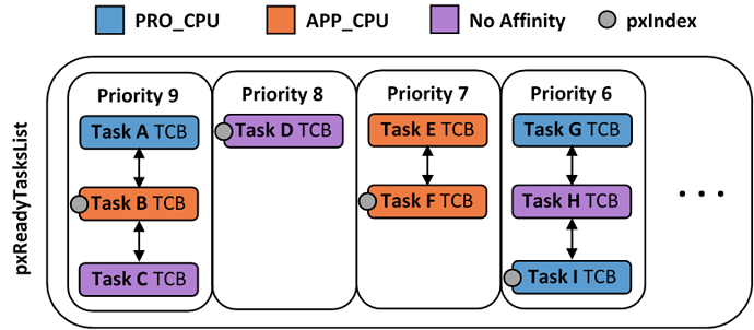
Blue and Purple: An Example of Ineffective Color Choice
Analyzing with the general principles of color choices, we can see the following issues:
Among the 3 colors used, a color pair is confusing for people with color blindness: blue and purple. For some certain types of color blindness (such as deuteranopia, i.e., green-blind), the elements are simply undistinguishable. See image below for the visual effect of this color pair under deuteranopia filter.
Even for individuals with common color vision, there are better color choices than blue and purple to provide greater contrast and convey message more efficiently.
The diagram relies solely on color to distinguish CPUs. This issue could be avoided by combining color with other visual cues. For example, different shapes like rectangles, dashed outlines, or hatched backgrounds could help distinguish elements from one another.
Color-Blind Simulation
Take the diagram using confusing blue-purple color pairs above, people with deuteranopia sees it as follows:
Simulation of Green-blind Vision
Getting a visual effect like this, people with green-blindness are unable to distinguish which tasks are operated by PRO_CPU and which ones have no CPU affinity. The communication fails due to poor color choices that are not accessible to individuals with this type of color vision deficiency. This issue could have been avoided by using redundant coding in the image, or by simply avoiding the confusing color pair.
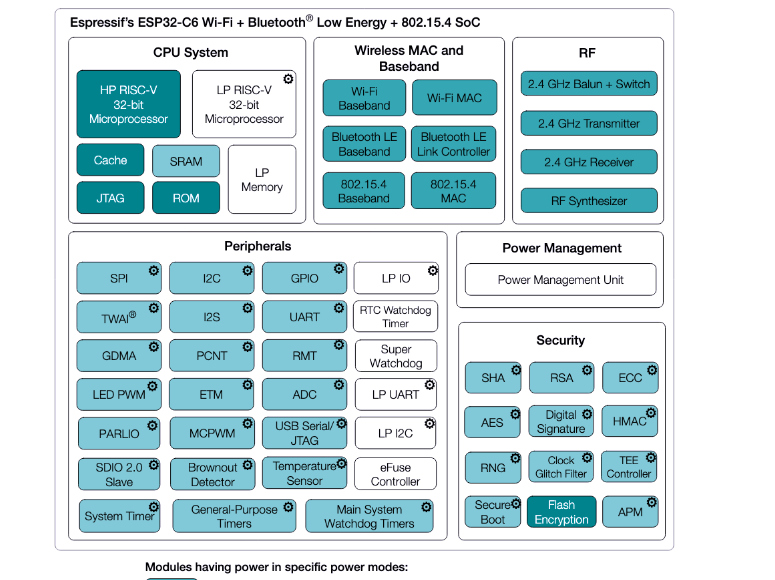
Example 2: Incorrect Color Code

Example Chip Datasheet Block Diagram
This is a block diagram from a chip datasheet. However, the contrast between Active and Active, Model-sleep modes seems not obvious enough. Simulating with color blind simulator lens “Tritanopia/Blue-Blind”, the colors for Active and Active, Model-sleep are nearly undistinguishable, as the image below:
Example Block Diagram Under Tritanopia Filter
This is because the colors used in the block diagram do not exactly match the color codes defined in our standard palette. To verify a color code, you can use a color picker tool, such as Digital Color Meter, which comes with the macOS system. This example serves as a reminder that we should always use the correct color codes when working with conventional or established palettes, to ensure visual consistency and accessibility for most users.
Example 3: Insufficient Contrast
The following table uses red and yellow to mark different GPIOs and functions. However, the contrast between the two colors is insufficient, making it hard to distinguish:
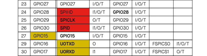
Colors with Poor Contrast
Colors that are easily distinguishable to individuals with typical color vision, such as red and yellow in the table above, often lead to the oversight of the poor contrast ratio between them. In fact, the contrast ratio between the red and yellow used in the table is merely 2.36 (very poor). For users with color-blindness, these two colors appear visually similar, like the example shown below:
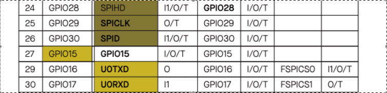
Visual Effect under the Protanopia Filter
Example 4: AI-friendly Approach
Previously in the Peripheral Pin Assignment table, the GPIOs were color-coded to indicate their functions. However, this approach is not AI-friendly, as AI systems can not interpret colors correctly. To improve accessibility for AI chatbot, we can add explicit textual information (P1, P2, P3, and P4, and the explanations as shown in the image below), in order to provide extra information in text form.
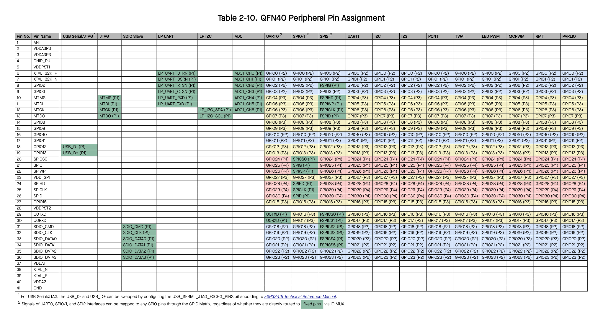
AI-friendly Approach for Peripheral Pin Assignment Table
Explanation to the Textual Marks Added in the Table
Note
In this chapter, only color is discussed. To be more accurate, text equivalents should be provided for all visual elements for AI ingestion, including not only colors, but also shapes, superscripts, etc.
Example 5: A Good Example
The illustration in Espressif document Preferred Parent Note is a relatively good example of color usage.
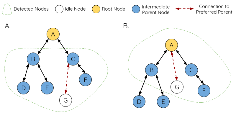
A Good Example of Color Usage
The arrow signs combine color with shape, demonstrating the redundant encoding approach. The “Connection to Preferred Parent” arrow not only applies a different color, but also uses a dashed line. In this way, even if the illustration is printed in black and white, the two kinds of arrows are recognizable; even for people who cannot distinguish dark red and black (i.e., protanopia), the illustration is still communicative.
All the colors in the illustration are distinguishable by color-blind people, as verified using Color Blind Simulator.
The color contrast is sufficient. The node colors in the illustration are clearly distinguishable even printed out in grayscale.
How to Improve?
Apply redundant coding for nodes as well. Use another shape to indicate the root node, such as a bolded circle, or adding background patterns to the nodes.
Add explicit explanation for the illustration. For example: Nodes B, C, D, E, and F are intermediate parent nodes. This brings extra benefits if the document is to be ingested in AI tools as well.
Summary: A Checklist
☐ Do the colors serve for communicative purposes?
☐ Is there a better way to convey the information than simply using colors? Could I accompany color-coded elements with text or shape indicators?
☐ If this document is to be ingested by AI chatbot, have I added explicit textual descriptions for the key information conveyed by colors?
☐ Do I choose colors from a colorblind-safe palette?
☐ Have I verified the palette’s visual effect under different color blindness filters, and ensured sufficient contrast before publication?